The Favicon and it’s friends

What is a Favicon?

favicon generation

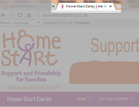
A Favicon is a small image which may appear in the browser tab as in the example above to the left of where it says Home-Start Derby…. It is created from a logo. I have created these for many sites in the past, they are nice to have but not essential.

However there are other related icons that are requested from a website for “favourites” on devices such as the iPad and iPhone. These are larger, but can be based on the same image. They frequently come up as “page not found” in error logs on websites. I do not generate these because it has not been particularly important to do so. Most of you will be unaware of them.

Part of the issue is how long these things take to create and add to a site, which is why I have not created all of them in the past. Continue reading The Favicon and it’s friends

Images and compression

Still confused about handling images?

This seems to be a recurring subject with many people. The issue here is that many photographs that are suitable to be added to a website need some form of processing before they are added to the site.

WordPress contains tools within the framework to resize and compress an image, however the difference between what you up load and what you finally see can be visibly different; the image processed from within WordPress is visibly softer (not focused).

Go and see the Panda

(you have to go to the site to see why I refer to a panda!) Continue reading Images and compression

Changes in WordPress

Some of my videos are now out of date following some changes made by the WordPress development team in the latest version of WordPress.

All of the sites I have built should update themselves to the latest version. There are one or two exceptions where I have a template that has not been upgraded, but for the rest of you, you should be on the latest version now.

The key changes that I have noticed are listed below. They are all improvements on the way WordPress works, so do check them out.

Password changes

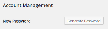
You used to have to create your own password in WordPress. This was a weakness because people could enter password123. (Which is obviously a weak password!). One of the plugins I use forced any new passwords to be strong, which got around the problem. WordPress has gone a step further.

If you wish to change your password you now get a screen like the one below.

newpassword1

Continue reading Changes in WordPress

Understanding how to use this site

I have added a page under the main menu that shows you how to use this site. There are currently over 350 news/ self help/ information items on the site with hints and tips and 34 fixed pages. I realised that some of you visiting here may not be aware they are there because they cannot be located directly through the main menu.

They are news posts that are accessed through the news and alerts page. Each is categorised according to the content in the page and it’s relevance.

To help you get as much information as possible from the information on this site please see this page for more an explanation of how the site works. How to use this site. 

For clients of Wingrove-Media

If you have recently been working with me, and I have developed a site for you, or I am hosting your site you can sign up to a monthly newsletter using the form below:

After clicking Subscribe please check your email account and confirm your subscription

Please note that if you are not recognised as a client you will not be added to the mailing list. Most general articles on this site are freely available to everyone, I have made this available in the same spirit of many other developers who wish to help people, if only in thanks to those that have helped me in the past when I first started. The purpose of the content in this site is primarily targeted at my client base who have a specific implementation or are using specific services to support their website and email. 

Please check the sidebar for a list of articles, or search the site for something using the methods described in the sidebar. There is a category cloud in the side bar which is used to categorise posts. You can use this to narrow down your search.

More on Home-Start Responsive site

Upgrade Offer

(Home-Start WordPress sites only)

In theory, I can remove and replace the WordPress templates I have used on your sites and replace them with a new template that is currently under development and viewable at this location: wingrove-media.com/homestart/

It is not quite a simple replacement as I will also need to replace some artworks in the header and in the sidebar and reconnect everything, and reconstruct the menu and then test.

I think this will take around 4 hours to complete per website. If you are interested in upgrading to a responsive website (mobile friendly) then please contact me. I can provide this upgrade at a fixed cost of £45 per Home-Start website over the next two months. Continue reading More on Home-Start Responsive site

Creating Banners for Home-Start (Revisited!)

If you tried to use this Tutorial and failed: Banners for Home-Start then I empathise with you.

I was working with a client this week who told me that she had tried to use it with no success. I tried it and did not succeed either. The problem was very subtle!

I had carefully formatted the text as Courier in the example. Assuming (rather foolishly) that this would be “safe and foolproof”. It was not.

In the examples I have given the quote symbol ” is incorrectly mapped to a different ASCII code, it is not the standard quote symbol used in writing code. It is a special version. This corrupts the code if you cut and paste from my example. When you paste it into a page in Text mode and save it, the code is removed!  Why? Because the ” symbol is not recognised and therefore the code is invalid. Rather than accepting invalid code, WordPress strips everything out so as to avoid the website from crashing due to poor or buggy code. That is good if you know what is happening, but bad if you don’t!

Making it foolproof

I have gone back and amended the tutorial by adding a downloadable text file with the correct text in it. Simply download it, open it with NotePad and then copy and paste the relevant section it to make it work. Do not use MS Word or any word processor to do this. Just a plain old text editor.  You can either go back to the original article or download the text file from here: boxes code

Just one tip, if you ever find something here which does not work, don’t assume it is something you did, it could be something I did! So drop me a line.

New Responsive Template for Home-Start

I read an article a few weeks ago that stated that there are now more mobile devices (iPads, iPhones, Android and Windows phones and other tablet devices) than desktop/ laptop computers accessing websites. This has interesting implications on websites. Up until a 3-4 years ago, most websites were static layouts. You just got a smaller version of your site on your iPhone/ iPad, but it was essentially the same site and the same layout.

Now it is becoming increasingly important to have different versions of you site for mobile and computer users.

How do you know the difference?

When a device tries to access your website, the server (where the website is located) can ask the device for information about the screen width. Once this is known decisions can be made to adjust the screen width and layout of your site depending on the device that is accessing it so that it is optimised for the device.

Home-Start Responsive Template

I had a request in July for a responsive Home-Start website. The sites I have built for Home-Start satellite offices so far, (40 of them), have been fixed layouts. While I have some experience with responsive layouts and adapting them from free templates, I had not created one for Home-Start sites. Well, the good news is we have one now, and it is close to being completed.

Here are two different versions of the same site: Continue reading New Responsive Template for Home-Start

Photographs – another strategy!

Image file size and WordPress websites

I have commented in the past, and also cover it in my video tutorial on images that it is important to reduce the size of the image before you place it on your site. The reason why this is important is because it will take up space in your hosting, and cause your site to load more slowly. As a broad guide the image size for most cases should be around 100KB or less, 200KB for a large image. I frequently find images that are 4MB or larger. These have been uploaded to sites pretty much straight from the camera.

The preferred way…

I still advocate; do your image processing outside of WordPress. Shrink the image down to roughly the target size which for images in the content area will be around 600 pixels wide. For images in a gallery, then 1024pixels wide.  Use compression to reduce the file size, then upload it.

If you have fat files on the site already…..

WordPress introduced some new facilities in image processing in May 2015. All sites have this built in.

To access it log into your site and look at the menu on the left and choose Media (Library) and check the last few things you uploaded. Make sure they are around 100KB or less unless they need to be larger.

If you find something that is straight off of a camera and over 400KB, then do the following. Editing images in WordPress

Look for Edit image button in the bottom left of the image.

Click on it.  Look for the Scale Image option in the top right.

scaling images

Change this to something close to your target size. Remember that there is no value in having an image 4000 pixels wide if the screen space in the content area of your site is only 600 pixels. It is as simple as that.

Next change the X value (first dimension) the second one will follow to maintain the aspect ratio of the image.

Then click on Scale. A copy of your image will be created in WordPress to your settings.  It is automatically saved* (*skip down to the bottom of these notes learn about some other things you can do at this stage).

Close the window using the small x in the top right of the window.  At this stage, the original large image is still on the server. But the smaller image is now available to you for adding to pages. So half of the problem has been solved.

You can always restore it back again by going back to view the image in the image library and selecting edit. You will see a drop down which says “RESTORE IMAGE ORIGINAL SIZE”.

BUT…..

The settings built into WordPress are quite aggressive. It really depends on your images and what is in them whether this works for you or not. I generally find that any image manipulation on the server yields a smaller file (good) but the image is soft (less detailed … bad).  So use with care. This is why I think it is best to do this work outside of WordPress before they are uploaded.

Other things you can do in WordPress

While in the image editor, you can also do the following within WordPress.

  • Rotate the image clockwise or anti-clockwise
  • Flip the image horizontally or vertically
  • Re-crop the image

50% of the problem solved!

It appears that these actions create another copy of the image. I am pretty sure that there is a course of action you can take which will remove the original. While experimenting and writing this article, I could not reproduce the key/ screen sequence. But I am sure I have done it in the past.

If you are trying to scale down a large file accidentally loaded on the site, then the last step is remove the original after you have created a copy. If I can reproduce those steps, I will come back and edit this. It is however worth resizing images as this will save bandwidth at the server and to the client. Remember mobile users pay per MByte.


Take care removing things from your site!

I dealt with a situation yesterday where someone needed to remove a sponsors logo from the footer of their site because they were no longer receiving sponsorship from the organisation. They were not sure how to do it, so they located the image in the media library and deleted it.  It solved the problem of removing the image from the bottom of the site, but created a new one. The code was still there, and a little symbol appeared along with the text “footer-logo” next to it.

I have not generally given information out about the footers. There is a reason for this; it generally seldom changes, and in most cases it is specially written code rather than created through the Widget menu option under Appearance. So it is not easy to edit, and with current security running on most of the sites, you cannot edit it anyway without compromising the security.

So if you need a footer changed let me know and I will change it for you. Continue reading Take care removing things from your site!

Using Images on your site

The following is covered in one of my video tutorials. Check video tutorial 7 for more details.

Some people are uploading images to their sites straight off of the camera or iphone. Firstly, well done for adding visual content to your sites. This is absolutely the right thing to do. However be aware of the following limitations and the impact they can have on the hosting and on your users.

An image displayed on your website is limited in size to the space available for it. Generally I advise 610 pixels wide unless it is in a gallery, then it can be larger so 1024 pixels wide might be ok. This means you need to scale down the size of your image before it is displayed on your site.

Why?

The website is set up to display an image in the available space on the page or in the gallery. If the image is 5000 pixels wide, it is reduced to 600 pixels wide in the browsers rendition of your website. So there is no value in sending a 5000 pixel wide image for a space that is only 600 pixels wide. (A pixel is a picture element or small dot that can represent one of 24 million colours, the screen you are looking at has millions of small dots). Continue reading Using Images on your site

Wingrove-Services
Privacy Overview

This website uses cookies so that we can provide you with the best user experience possible. Cookie information is stored in your browser and performs functions such as recognising you when you return to our website and helping our team to understand which sections of the website you find most interesting and useful.

You can adjust all of your cookie settings by navigating the tabs on the left hand side.

My privacy policy can be located here: Wingrove Media Privacy Policy (opens in a new window)

My Cookies Policy can be found here: Wingrove Media Cookies Policy (opens in a new window)