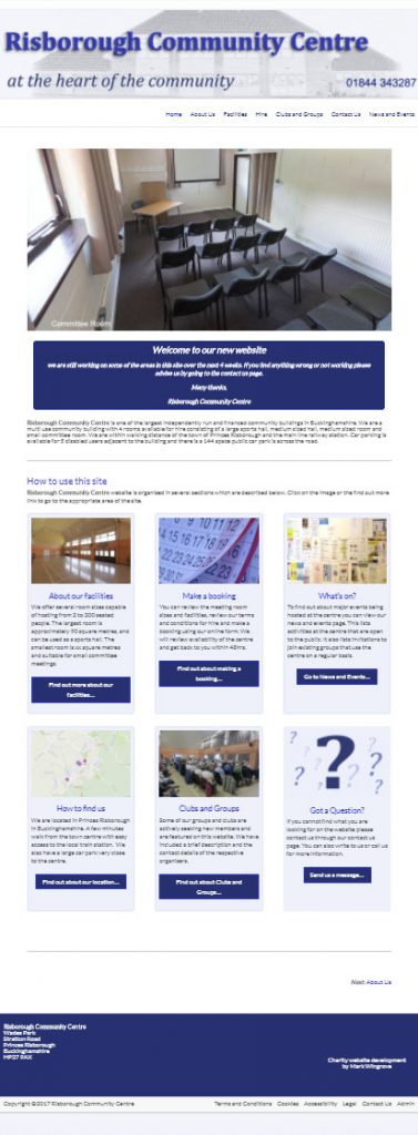
I thought this might be worth flagging up to everyone. I am in the final stages of developing this website for a local Community Centre. http://risboroughcc.co.uk
The site uses a free template called Spacious which is freely available. I have used this in other recent cases because it is a header with an optional sidebar and a footer. The content area can be full screen leaving you with a largely open white space.
As I have mentioned before practically all new designs tend to favour mobile oriented websites because there are more people accessing websites from mobile devices. This is also upheld when I look at the stats on most sites (these tell you how many mobile vs fixed users visit a site), it is typically around 55% mobile and 45% fixed, but it varies site to site.
This means a two or multi column approach might work better particularly for the home page. This tends to contain a lot of high level information and is guiding the user into the site. It is also worth noting that a multi column page needs to collapse down to a single long column for a mobile user with a responsive website.
In this case I have used a graphical layout tool called Divi Builder. If you are hosting with me, I can add this to your site and you can switch it on for selected pages.
As it is graphical it is easier to grasp than using special inline codes. However to get the most out of it, you need a wide full width play (content) area.
Anyway, if you are interested drop me a line and I can add it in for you and you can have a play. The following images show the users view of the site, the editor layout view of the site. The image at the bottom shows you what happens when the same site is viewed on a mobile phone. All of the columns collapse into a single column.
This is not the same as the Divi Template that I have commented on before, this is the layout tool that is used in that template, but it can be used with any template.
Key benefit for upgrades
In most cases page layouts can remain as they were. You only worry about the more complex pages and apply Divi Builder to them to get them to look how you want them to look.
If you were to move over to the Divi Template 100% it is a lot of work to move a complete site over and rebuild it.
Visual Layout tool
This is the editors view of the front page layout.

This is what a user sees,
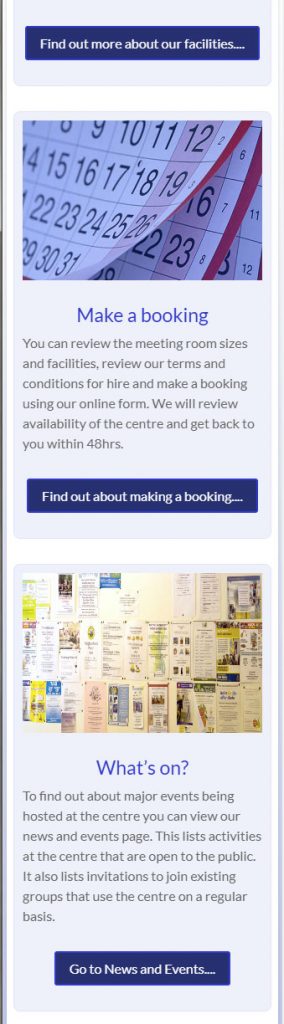
Mobile version of the home page panels.
On the desktop view there are two rows of three panels. When viewed on a mobile phone these collapse down into a single column so you can still read the content as in the simulated phone image below. You can see this for yourself by viewing the site in a browser and making the browser screen narrower.